Beyond Words: What Else Proofreading Entails
Have you seen that meme about proofreading circulating the internet that has a board book with the number 5 on one page and a picture of six bananas on the corresponding page? It makes me chuckle whenever I see it, and it’s a great reminder that proofreading includes more than just the writing.
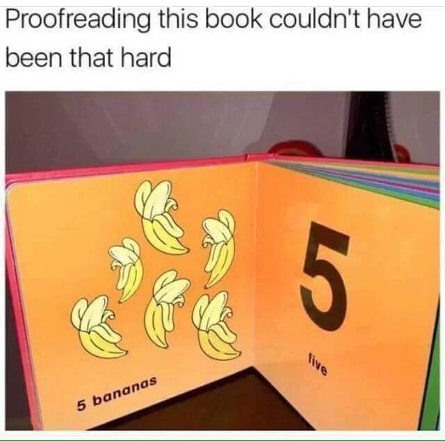
Meme with “Proofreading this book couldn't have been that hard” above a board book showing the text “5 bananas” with an image of six bananas
Editing vs. Proofreading
First, let’s explain the difference between editing and proofreading.
Editing, whichever level (developmental, line, heavy, light, etc.), is done when the manuscript is still in progress, although possibly at the end of the process.
Proofreading, in its true sense, is looking at the page proofs (the drafts of what a document will look like in its final form) for any final changes. These are details — by this point, the words themselves are not likely to be changed.
Proofreading entails both focusing in on the details of the language and widening out to look at the big picture. That means proofreading the text can involve reviewing the design as well. It helps to have an understanding of some basic best practices in typography and graphic design. I got a background on design during my graduate program at the University of Baltimore, studying creative writing and publishing arts.
Here are a few things that I look for while proofreading that go beyond the words.
Hyphenated Lines
Different publications have different levels of comfort in terms of how much hyphenation is okay — some publications don’t want any hyphenated line breaks and others are okay with some. But there are still a few typographical rules of thumb.
Back-to-back hyphenated lines: There shouldn’t be two lines on top of each other that each end with a hyphenated word.
Hyphenation between syllables: Dictionary entries include the syllables of a word, and if a word needs to break across a line, the hyphenation should be between syllables. Most software programs are good at doing this automatically, but it’s good to check, especially if it seems odd (some syllable breaks are, admittedly, odd).
Confusing hyphenation: Depending on the word and the context, sometimes a hyphenated word break can add some confusion as the reader moves from one line to another. Guessing how the word will continue can pull a reader out of the reading and make them have to reread (or misunderstand).
Multiple hyphenated lines in a paragraph: This depends on the client’s style, but if a paragraph has several hyphenated lines, that’s a clue that the designer probably should tweak the paragraph. Too much hyphenation makes more a rougher reading experience and affects the aesthetics of the page.
Hyphenation across pages or spreads: A reader shouldn’t have to move to a new page to finish a word broken by a line break, especially if it involves a page turn.
Widows and Orphans
Widow and orphan are typographical terms that refer to where a line falls on a page. What’s the difference? Honestly, most people get them mixed up, so much so that a recent Chicago style quiz on editing lingo (spoiler alert) didn’t have a wrong answer on that question (but the InDesign Skills website has an explanation if you’re curious).
Basically, having a single word that’s all alone at the end of a paragraph or a single line (especially if it’s short) on the top or bottom of a page needs some friends. This convention is partly for design aesthetics and partly for readability.
Charts and Graphs
Proofreading charts and graphs involves both looking at the numbers and looking at the elements of the charts and graphs themselves.
The proofreader is likely not responsible for a thorough fact-checking, but the proofreader should review the math to ensure that it makes sense. If something seems odd about the numbers, I mark them and do the math to see if the data is accurate (if it’s at my ability level). It’s especially worth checking if something is a percent change or a percentage point change because people often get these confused.
A proofreader also needs to pay attention to consistent terminology and consistent formatting across all charts and graphs. If they’re numbered, they need to be in sequential order. Titles should be clear and specific but not too similar or identical. And these elements should be in the same order that they’re mentioned in the text, whether they’re on the same page as the text reference or not. Charts and graphs should also follow a consistent style for capitalization, etc., and any abbreviations used should be clear to the reader.
Page References
Text sometimes moves around during proofreading, so checking page references should be at the very end when text placement is fixed. I also sometimes see placeholder text for future page references, and I generally will mark those places as a reminder to add the missing page reference.

That said, I double check if a page reference matches up with the actual page numbers and I make sure the page numbers are in sequential order (especially if sections of a project, such as a book or magazine, are designed by a team of designers).
Images
The graphic designer should ensure that images have a clear enough resolution for print or web publication, but a proofreader still has several aspects of the photos to check:
Remaining watermarks, perhaps if the photos haven’t been purchased yet
Photo captions to make sure 1) the text doesn’t have any typos or errors, 2) numbering (such as for figures) is in sequential order, and 3) the text of the caption actually matches the photo
It’s not just a bunch of white people – if images include people, there should be a wide range of diversity in terms of age, race, ethnicity, ability, etc., especially if the subject matter is about the general population or a large group of people.
Reviewing all of these elements during proofreading is a service to the reader to help them have a clearer and more enjoyable reading experience.